For every screen i have been adjusting the text placement so the text looks balanced and tidy.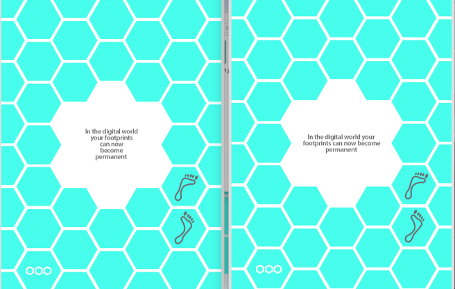
Developmental Practice
Sketchs


Here are some of my development wire frames for the final prototype
Updated content
Below is a list of each page and the content wrote on it is, as you can see there is a lot less text on each page and the directions are also more clear:
Logo page
Contents
explain icons
worksheet page
Supervisor guide
Completion page – Amazing, you’ve completed every section
Reflect
This section is about online awareness and what can happen with our information. You will work alone and then have a group discussion.
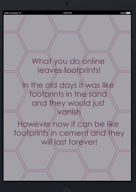
What you do
leaves footprints
In the old days it was like footprints in the sand and they would vanish
In the digital world your footprints can now often be permanent
Which means they can be copied and shared
How do you keep information private in the real world?
How do you keep information private in the digital world?
Before you post anything online think..
What information do you want to share?
What information do you want to keep private?
Discuss with the group
Appreciate
This section is about being grateful for the things we have in our life. You will work alone on the app and also receive a worksheet to complete.
Type 1 thing in your life that makes you feel happy
Type 1 thing in your life that makes you feel supported
Type 1 thing in your life that makes you feel loved
Type 1 thing in your life that makes you feel encouraged
Type 1 thing in your life that makes you feel excited
Suggestion in corner – This could be anything like : People in your life Family or friends, Pets, Places you’ve visited, A memory, A conversation, Something your looking forward to in the future
Collect a worksheet and a selection of paints from the supervisor
Complete the instructions on the worksheet and upload a picture onto the app
Praise
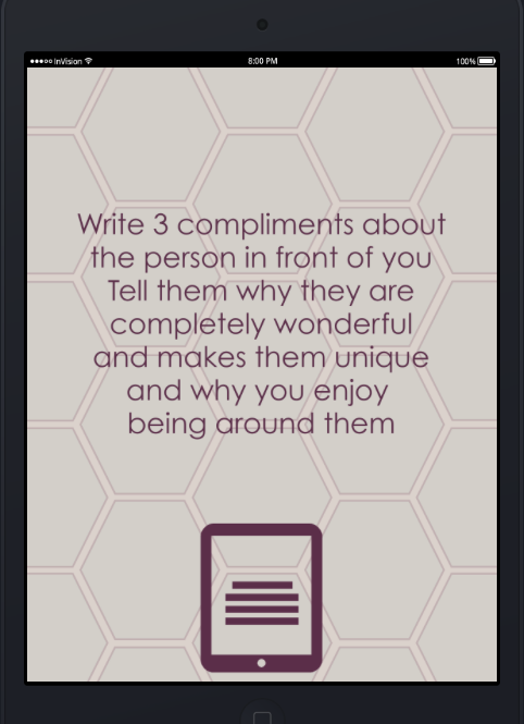
This section is about social awareness and how interacting with people online can be different to interacting with someone in person. You will work in pairs, one partner will be online and one will be in person
List 3 compliments to send to the person in front of you
Suggestion in corner – Tell them why they are wonderful, what makes them unique and why you enjoy being around them
List 3 compliments to tell the person beside you
After both interactions
How did each person react?
Could the online receiver show their reaction over the iPad?
How did it make you feel to see the receivers reaction when you had a conversation?
When sending something online
think …
Could what you are sending get misinterpreted
Will the receiver understand without seeing your body language and expression?
Re – Wording
After feedback I looked at the whole app and re-worded a lot of the pages, I found that I needed to make it very clear for the user what exactly needed done. For example, one of the pages asked the user to “write” when really the user needed to “type”
I have also condensed the amount of information on a few pages, the below page has now been made into multiple pages. I felt this needed to be done to hold the users attention
Section adjustments
Below is images of trying to get the section “buttons” to look like they belong to the page, as you can see the last hexagons with the coloured stroke work best but the colour font is hard to read so this will be changed to grey.


Possible Section Selection page
Testing 3 large hex flowers for placement of the 3 different sections. I think with all the different shapes in the image that the user would be very distracted and not be able to differentiate between the background and the three shapes correctly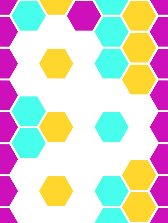
Logo page
This was early testing with the old font and colour but i like the placement of the hex shapes. I really like the flower shape and will definitely be having it reoccur through out the app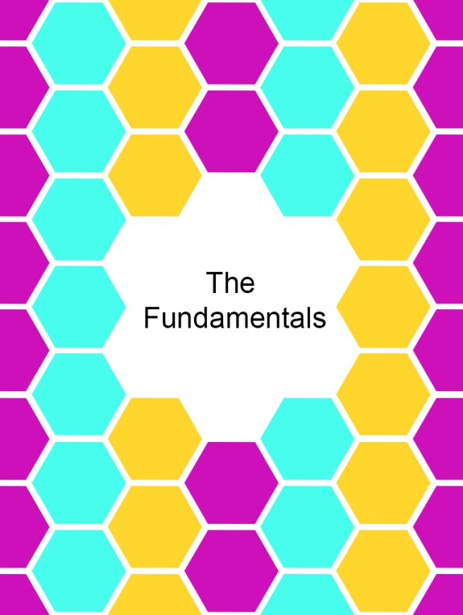
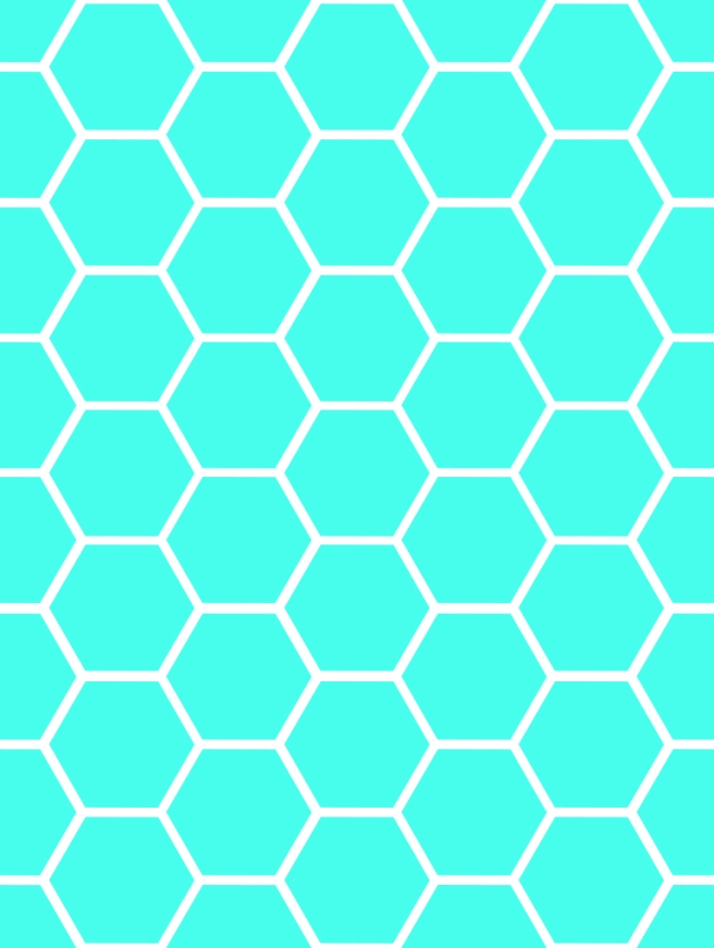
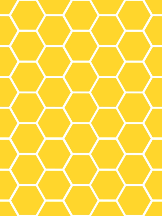
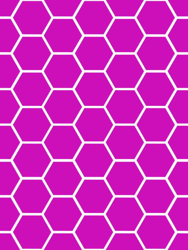
Single Colour Backgrounds
This is the three single colours which will be the backgrounds of each section, I’m very happy with how they look as they are very fresh and vibrant
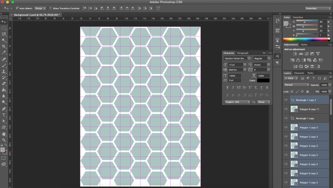
Grids
One of the first things i needed to rectify with the new prototype was the miss shaped hexagons, to do this i used the below guides and grids, the full group of hexagons was then scaled to go right to the edges as i felt it was unfinished to have the points on the edge.


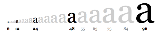
Typography Sizing
I researched on the apple website to find out if there was desired font sizes to use while creating an app. The below information was a good starting point but it was not what i needed.
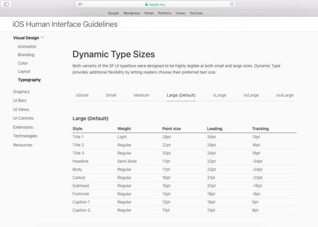
After further research i decided to use a classic typographic scale and use font sizes 12, 24 and 48 which i think work very well